HSL Curves
The HSL Curves tool (hue, saturation, luminance) can be used to further sculpt your color grade. This tool includes five panels - Hue vs Hue, Hue vs Sat, Sat vs Luma, and Sat vs Sat. In the versus concept you are adjusting one item in relation to the other. You can select multiple control points along any of these curves. This tool also includes an Extended Mode setting like the Six Vectors tool.
To start, ⌘-click the line to add a new point along the curve graph (option-click to delete a point). It changes the horizontal position of the curve graph.The next point on the graph changes the shape of the graph relative to the horizontal position of the line. Right-click a control point for more options. A color picker can also be used to add control points.
Click on the colored circle to add a point on the curve graph accordingly to the color range. To add all points of all color ranges on the line at once, click on the multicolored circle.
The HSL controls use B-Spline and Bézier curves. Bézier will be more familiar to users, but B-Splines curves provide smoother results. There are buttons in the on-screen overlay to modify the control points. The top button  makes hard, linear transitions at the control points. The second button
  makes them smooth. The curve will bend towards the control points, but will not be directly locked to them. The third button
  locks the curve smoothly to the control points. This third setting will be similar to curve controls used in other applications and filters. Click between these three buttons to change the shape of the curve. When you select the third (locked) option, you will need to click it again to disable it, before selecting one of the other two.
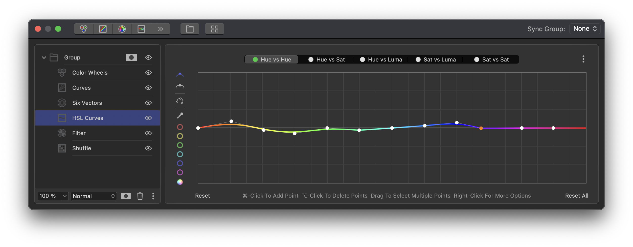
Hue vs Hue

Hue vs Hue enables you to select a color and shift its hue. Let’s say you want to adjust skin tones slightly. Use the color picker to select the correct color and it will add a control point on the graph, most likely at orange. It will also automatically add two additional points on either side to restrict the range. You can move these outer points to widen or tighten the adjustment area. As you move the main control point up, the orange skin tones will become more green. If you shift the control point down below the base line, the skin tones become more magenta.
Hue vs Sat
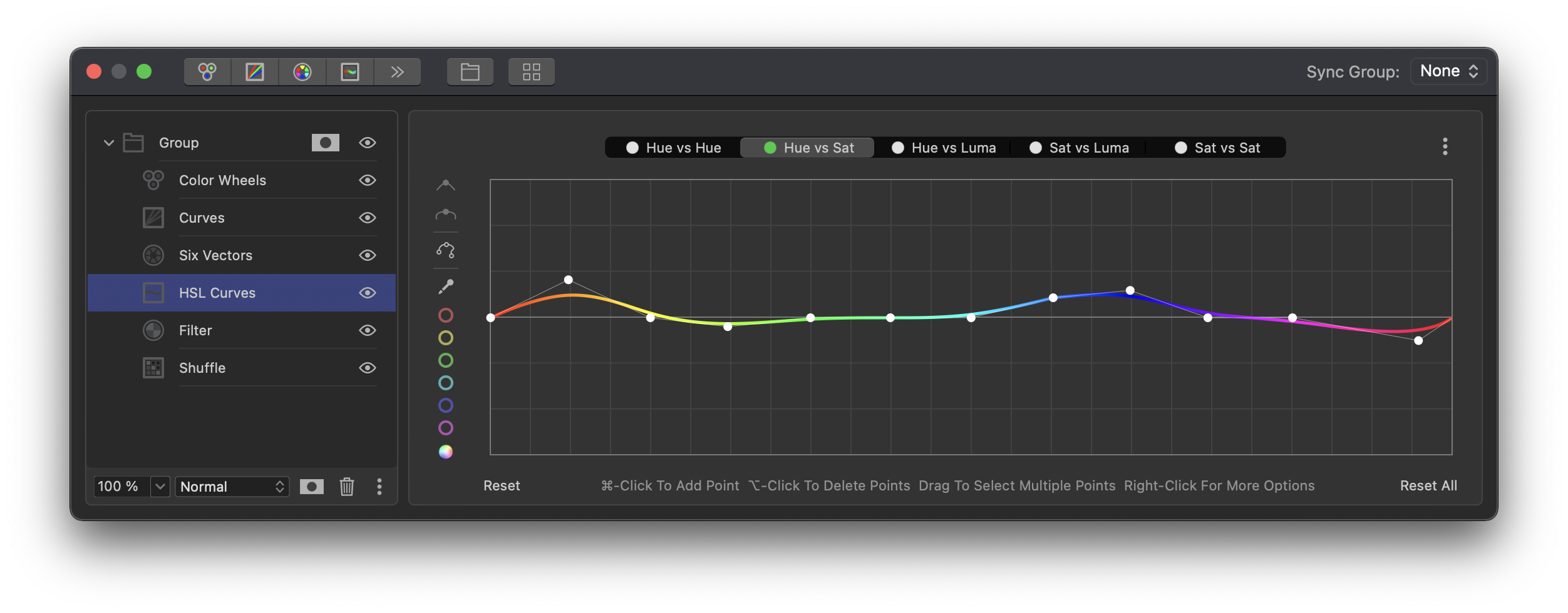
Hue vs Sat enables you to increase or decrease the saturation of specific hues. For example, someone is wearing a vibrant blue sweater in your clip and you want to decrease the intensity of the blue. Simply ⌘-click on the blue section of the line, plus two points on either side of the blue control point to set the range. Or use the color picker to select that color within the viewer image. Pull the control point for blue down to decrease the blue saturation in the image. If you want it to be more vibrant, simply push the point up above the base line.
Hue vs Luma
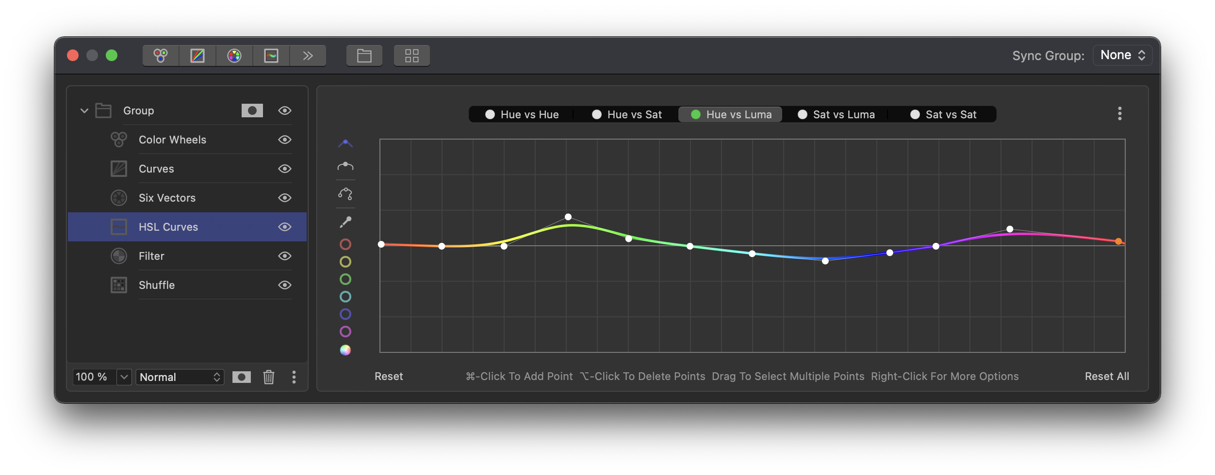
Hue vs Luma enables you to brighten or darken a portion of the image in relation to its hue. The color selection and operation works like Hue vs Sat, except with luminance. As you raise or lower the control point around the base line, objects with the selected hue will become brighter or darker.
Sat vs Luma
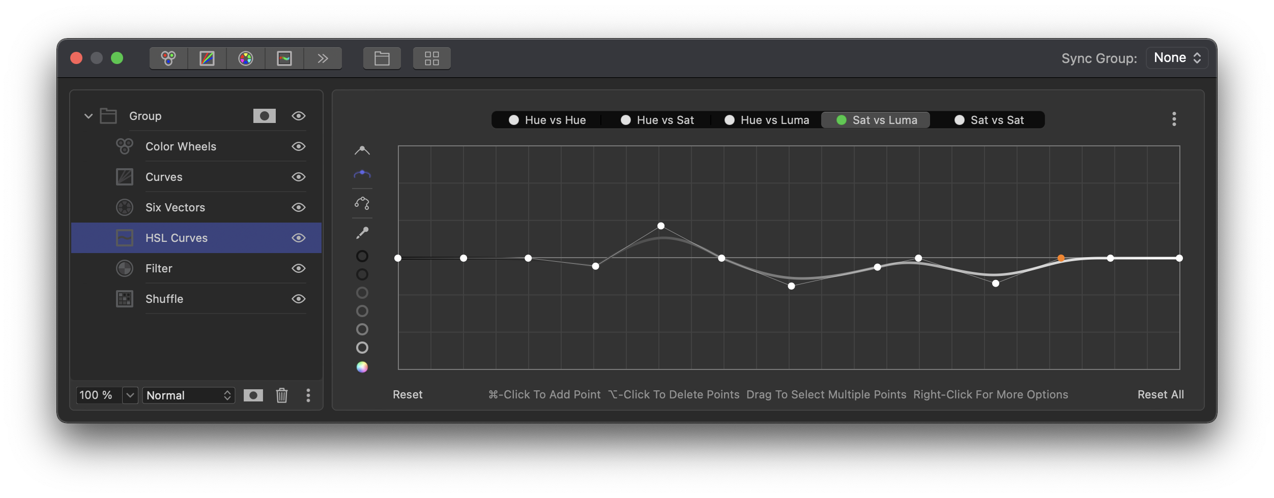
Sat vs Luma works differently than the previous three curves, where the base line represented all possible hues. With Sat vs Luma, the baseline represents luminance from black (left) to white (right). One way colorists use this control is to maintain pure blacks and whites within an image. As you push extreme grades, you will end up contaminating light and shadow area in your image with color. You can use Sat vs Luma to reign that in. Add control points about five gridlines inward from each end. Be sure to set the control point setting to locked (third button). Now drag the two end control points all the way down on the graph (zero color saturation). This creates a roll-off of color in the darkest and lightest parts of the image. Drag the inner two control points left or right to increase or decrease the range within which this desaturation occurs. If the curve from the bottom to the baseline is too steep, this will result in artifacts. When the control points are located farther towards the middle of the line, the transition from desaturated to saturated will be more graceful, but you may lose too much color. This should be adjusted to taste.
Sat vs Sat
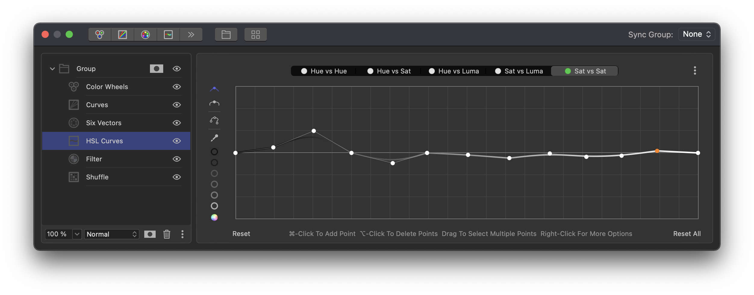
Sat vs Sat is similar to Sat vs Luma, except that the baseline in this tool represents saturation. Left is not saturated and right is fully saturated. On a vectorscope, left corresponds to the center and right would be the outer edge. Sat vs Sat enables you to even out relative saturation differences within an image. Picking control points along the line means that you are selecting from various levels of saturation. If the clip is extremely saturated and you select a point in the middle, then you are selecting a point within the middle of the image’s saturation range. If the image has a normal level of saturation, then you will need to pick a control point more to the left on the baseline, because this image has less overall saturation to begin. Move the control point up or down to increase or decrease the saturation in the selected range. The vectorscope will display that change relative to the saturation of other elements within the image.